Constructing and Sharing Maps |
|
ArcMap is an easy-to-use program to display map data, symbolize it in useful ways, and output it to common, shareable file formats.
This tutorial will guide you through constructing, coloring, and saving a simple map using ArcMap, the primary component of ArcGIS, using prepared data. In the process of doing this, you will become familiar with some of the menus and procedures you would use to create maps using your own resources.
Since this tutorial will be using specific maps and data, the first step is to make your own copy of the tutorial data. First go to the network drive  G: (aka Google Drive File Stream), open the folder G: (aka Google Drive File Stream), open the folder  Shared drives, then the folder Amherst Software, then the folder Maps, and finally the folder Introduction to GIS. Copy this folder, or at least the subfolder constructingmaps, to a location with fast access: Shared drives, then the folder Amherst Software, then the folder Maps, and finally the folder Introduction to GIS. Copy this folder, or at least the subfolder constructingmaps, to a location with fast access:
- your local drive
 C:, if you are using your own own computer and are off campus. Consider a location like your Desktop rather than the folder Documents, as the latter is often a link to the network drive OneDrive. C:, if you are using your own own computer and are off campus. Consider a location like your Desktop rather than the folder Documents, as the latter is often a link to the network drive OneDrive.
- your network drive G:\My Drive, if you are on campus or using a shared computer. For better performance, right-click on the copied folder and in its contextual menu select the item
 Drive File Stream > Available offline, which will keep a local copy of your files in sync with the network files. Drive File Stream > Available offline, which will keep a local copy of your files in sync with the network files. Since some — but not all — of the ArcGIS programs have trouble handling names with spaces or special symbols, do not rename the folders unless necessary.
The folder constructingmaps contains the following files, amongst others:
| states.shp |
counties.shp |
cities.shp |
gtopo_1km.tif |
| states.dbf |
counties.dbf |
cities.dbf |
gtopo_1km.ovr |
| states.prj |
counties.prj |
cities.prj |
gtopo_1km.tfw |
Note that many of these files have the same root name, e.g. states;
this means that they must all stay together to work properly.
Each
such set of data is known as a shapefile (although only
one file has the extension .shp), and is one of the basic
data formats that is understood by ArcGIS.
- Click on the menu
 Start. Start.
- Scroll down the menu and click on the item
 ArcGIS, and then click on the menu item ArcGIS, and then click on the menu item  ArcMap. ArcMap.
- ArcMap will take a while to load. Eventually, the dialog ArcMap - Getting Started will appear; if necessary click on the template Blank Map, and then click on the button OK.
The main ArcMap window is divided into two panes:
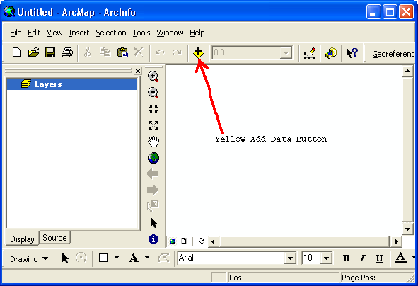
The larger pane on the right is the map display area. You can display geographic data here by adding it with the yellow-and-black button  Add Dataor menuing File > Add Data > Add Data…. It’s located in the Standard toolbar, which is usually docked just below the menus in the ArcMap window. Add Dataor menuing File > Add Data > Add Data…. It’s located in the Standard toolbar, which is usually docked just below the menus in the ArcMap window.
Prepared data is ready to use with ArcMap, without the
need to first establish its geographic basis.
- In ArcMap, in the toolbar Standard, click on the button Add Data.
- The special file dialog Add Data will now appear. It looks like an ordinary file dialog, but it only lets you see some of your folders, viz. those to which you have explicitly connected. Once you set up these connections, the folders will appear in all subsequent dialogs, and you will thereafter have quick access to them. When you need to set up a connection:
- Click on the button
 Connect to Folder. Connect to Folder.
- In the new dialog Connect to Folder, navigate to the folder where your data is stored; in this case, it would be the folder constructingmaps that you previously copied to your U: or C: drive.
- Click once on the folder’s name.
- Click on the button OK.
- If necessary, navigate into the folder constructingmaps.
- Select the file
 states.shp; note that only one file with this root name appears, another feature of this special dialog. states.shp; note that only one file with this root name appears, another feature of this special dialog.
- Click on the button Add.
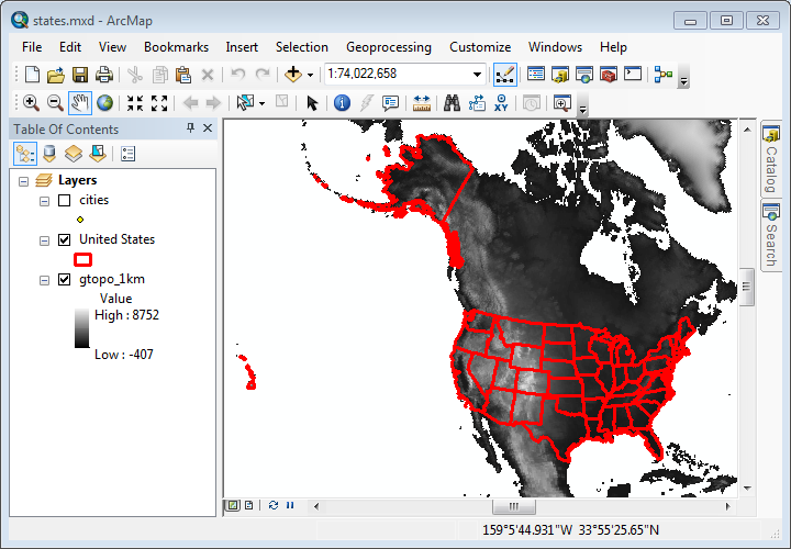
A map of the United States including Alaska and Hawaii should now appear
in the map display pane. Data such as states that
are displayable geographically are called layers, because
they overlay each other like transparencies when you
add them. Maps can display several different kinds of
layers: points, polylines, polygons, images, and others.
The layer states consists
of polygons defining the boundaries of the fifty states.
Each of these polygons is called a feature of the layer.
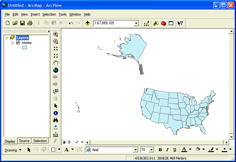
The layer’s name will also be listed in the pane on the left, which is called the Table of Contents. By default its name is the data file’s root name, but it can be easily changed by cllcking on it and typing.
Experiment: Change the name of the layer states by
clicking on it, pausing, and then typing something else,
e.g.
United States.
The Table of Contents provides three views of your data. The primary view is  List by Drawing Order, which shows just the simple names of data layers, corresponding to what is visible (or potentially visible) in the map pane. The secondary view is List by Drawing Order, which shows just the simple names of data layers, corresponding to what is visible (or potentially visible) in the map pane. The secondary view is  List by Source, which lists the full path names of your data files. In addition to data layers, it also shows data you’ve referenced that is undisplayable, such as tables of additional data. Usually you’ll want to stay in the Drawing Order view. The third view, Selection, is a topic for another day. List by Source, which lists the full path names of your data files. In addition to data layers, it also shows data you’ve referenced that is undisplayable, such as tables of additional data. Usually you’ll want to stay in the Drawing Order view. The third view, Selection, is a topic for another day.
Experiment: Click on the tabs Display and Source to observe how the view of your data changes.
Before we proceed any further, it’s a really good idea to save your map.
ArcMap documents preserve your current arrangement for use at a later time, and are especially useful after the occasional ArcMap crash.
In addition, ArcMap is aware of the location of a saved map, establishing it as the Home folder so that related files are easy to find.
You’ll therefore want to continue to save them on a regular basis, for example every time you’re satisfied with the current view.
- In ArcMap, select the menu File, and click on the menu item Save. You can also simply click on the button
 Save. Save.
- The first time you save your map document, the dialog Save As will appear. It’s highly advised that you navigate to the same folder containing the shape files you’ve added to the map, in this case constructingmaps.
- Your map document will have a file extension of
.mxd .
Choose a root name describing your project, e.g.
states, and click the button Save.
ArcMap documents do not actually contain the data you add to them, such as the layer states. Instead, they contain pointers to your data, as well as information about how to display them. That’s why it’s a good practice to keep them together, unless the data is in a standard, shared location such as an archive.
Because ArcMap documents only contain links to your data, another good practice is to make those links relative to the map document. For example, the data might be referenced as being “in the same folder as me” rather than being “in the folder C:\Documents and Settings\username\Desktop\constructingmaps”. Either of these is known as a path to the data; the former is called relative while the latter is called absolute. Relative paths will facilitate moving the folder containing your map file along with all the files linked to it to another location.
- In ArcMap, select the menu File, and click on the menu item Map Document Properties....
- In the dialog Map Document Properties, click on the checkbox
 Store relative path names to data sources. Store relative path names to data sources.
- Click on the button OK.
- Back in ArcMap, click on the button Save.
Note that you can only open ArcMap documents by double-clicking on them in the Windows Explorer, or by opening them from within ArcMap through the menu File and the menu item Open (or clicking on the button  Open). They may not be added to a map using the button Add Data, which is reserved for the different pieces of data that make up a map. Open). They may not be added to a map using the button Add Data, which is reserved for the different pieces of data that make up a map.
The primary toolbar is called Tools, and it contains the buttons listed below. They provide quick ways to zoom in and out, pan across the map, restore a map to its full extent, and return to previous views of the map:
| Button |
Action |
 |
Zoom in: click a point to zoom in to it by 50%, or click-and-drag a rectangular region to view. |
 |
Zoom out: click a point to zoom out from it by 50%, or click-and-drag a rectangle to contain the current view. |
 |
Zoom in to current center by 20%. |
 |
Zoom out from current center by 20%. |
 |
Pan (drag) the map. |
 |
Full extent: zoom out to the full map view. |
 |
Go back to previous map view — if you lose your map, this will bring it back. |
 |
Go forward to next map view. |
 |
Select features. |
 |
Clear selected features. |
 |
Identify features. |
 |
Find features. |
 |
Go to an (X, Y) coordinate position. |
 |
Measure distance along a path you define with a series of clicks (double-click the last). |
The toolbar is shown above docked between the two window panes, but may be located in some other position when you open ArcMap for the first time.
Experiment: Locate the toolbar and drag it into position between the two panes (unless you prefer it somewhere else).
Experiment: Try zooming in and out of the map, panning, and using the full extent button to return to the original map view. Also try using the back and forward buttons to move along the sequence of views you’ve created.
We’ll talk about the other tools later.
The degree to which one has zoomed in to or zoomed out from the map is commonly expressed by comparing a distance on the map to the same distance in the real world. So, for example, the distance from New York to Los Angeles is about 6 centimeters in the computer view above, but roughly 4,000 kilometers in real life. Since 6 cm = 0.00006 Km, we can calculate a ratio of these two numbers that doesn’t depend on units, 0.00006 Km : 4,000 Km = 1 : 70,000,000. This ratio describes what one map unit corresponds to in the real world, and is called the map scale.
ArcMap displays the current map scale in a text field / menu at the top
of the screen just to the right of the button Add
Data:
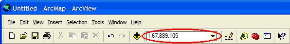
Intially the scale for your map will be around 1 : 100,000,000,
depending on the size of the map display pane. As you
use the zoom buttons in the Tools toolbar,
the scale adjusts automatically. It’s also possible to
change the map scale by clicking and typing directly
in the text field, or by clicking on the adjacent pop-up
menu button  and
choosing from a list of common values. and
choosing from a list of common values.
Experiment: Observe how the map scale changes as you zoom in and out of the map. Try changing the scale by typing a number in its text box, and by choosing a value from the menu.
Note that as you decrease the second number in the map scale ratio, the scale increases. Cartographers therefore use the following terms to describe scales:
- At a small scale:
- the ratio is small;
- the second number is large;
- the map is zoomed out;
- you can see a large area;
- you see less detail.
|
- At a large scale:
- the ratio is large;
- the second number is small;
- the map is zoomed in;
- you can see a small area;
- you see greater detail.
|
When you add a map layer, you will also bring along an attribute table describing the individual features of the map. For example, every state in the map has a name, and we may want to label them, so we need to know how those names are associated with the polygons.
- In ArcMap, in the Table of Contents, right-click on the name of the layer, e.g. states.
- The layer’s contextual menu will now appear; it provides many actions that apply just to this layer. Select the menu item
 Open Attribute Table. Open Attribute Table.
Shortcut: you can also open a layer’s attribute
table by holding down the Ctrl key and double-clicking
on the layer’s name in the Table of Contents.
An attribute table appears in its own window floating above the map, and it looks something like the following:
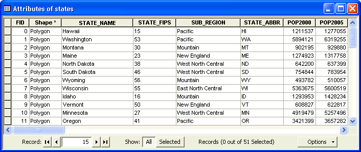
In this table, every feature of the layer is listed in its own row or record. Each column or field represents a different attribute of these features. So, in this case, we see each state name on a different row, along with its population in 2000 and 2005, its federal information-processing code, etc.
Every attribute table will begin with the two structural fields FID and Shape. The first is a Feature Identifier that will always be a unique number to distinguish one feature from another. The second is a summary description of the geography of this feature; hidden behind the text “Polygon” there’s a lot of information about how to draw the lines that comprise it.
All other fields are optional, but their presence is important to enable the true power of GIS. These fields are usually one of two types:
- Text, such as STATE_NAME; these field values are left-justified.
- Numeric, such as POP2000: these field values are right-justified.
Note that sometimes fields appear to be numeric but in fact are text, e.g. STATE_FIPS, because they are stored as a sequence of individual digits.
The features in a table are often in a random order. However, you can compare them more easily with each other by sorting them by any one of the attributes in the table.
- In ArcMap,
in a layer’s Attribute table, pick a
field, e.g. STATE_NAME, and double-click
on its header, the name of the field at the top of its
column.
Note that the column will sort itself in ascending order,
from A to Z.
- Double-click on the header a second time; the
column will now sort itself in descending order, from Z
to A.
- Locate a field whose values are common to
multiple records, e.g. SUB_REGION,
and right-click on its header to bring up
its contextual menu; you’ll see the same two
options listed,
 Sort Ascending and Sort Ascending and  Sort Descending, but
instead select the third one, Sort Descending, but
instead select the third one,  Advanced Sorting…. Advanced Sorting….
- The dialog Advanced Table Sorting will
now appear; it lets you choose multiple columns
on which to sort in sequence:
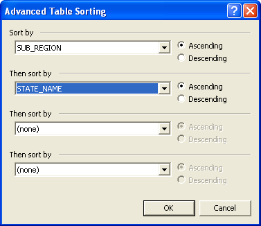
- In the menu Sort
by, select a field whose
values are common to multiple records, e.g. SUB_REGION.
- In the menu
Then sort by,
select a more specific field, e.g. STATE_NAME.
- Click on the button OK.
Note
that now all of the records are sorted according
to the first field,
and within each group the records are sorted
by the second field.
Note that all of the data in a row stays together, even though
you’ve sorted on a single column (something that doesn’t
automatically happen in a program like Excel); this is
a common feature of a database.
Experiment: Sort the data by different fields in the table.
Once you have found a feature in a table, you can locate
it on the map in a few ways.
The most common is to select it, but you can
also flash it and zoom to it.
- In ArcMap,
in a layer’s Attribute table,
scroll to a feature you are interested in, and
click on the button
 Select
Record at the far left end of the record. Select
Record at the far left end of the record.
The feature is now selected , and its
record will be highlighted in an aqua color.
In addition, the feature will be highlighted in
the same color on the map itself; you may have
to scroll, zoom, and/or move the attribute table
around to see it.
- To deselect the record you
can either:
- Right-click on the button Select
Record and then click on the menu item Select/Unselect;
- In the toolbar Tools,
click on the button Clear Selected Features.
- In an intricate map it can sometimes be hard
to pick out a selected feature, so sometimes
a better way to locate it is to flash it, by
right-clicking on the button Select
Record and then click on the menu
item
 Flash. Flash.
- Often the best way to locate an item is to zoom
directly to it, by right-clicking on the button Select
Record and then clicking on the menu item Zoom To.
The information in the attribute table can be
used in a more focused way to explore map features.
When you don’t have the attribute table open, and you
recognize features on the map, you can also select them
using the tool Select Features.
- In ArcMap,
in the toolbar Tools,
click on the button Clear Selected Features;
this will remove any highlighting remaining from
the previous procedures.
- Again in the toolbar Tools,
click
on the tool Select Features.
- In the map pane, click
on any feature you recognize, e.g. Massachusetts.
The feature will be highlighted with the
same aqua color seen in the attribute table.
- If it’s not already, open
the attribute table .
- In the attribute table, click on the button Show: Selected.
Now only the selected feature will appear, so you
don’t have to scroll through the records to find
it.
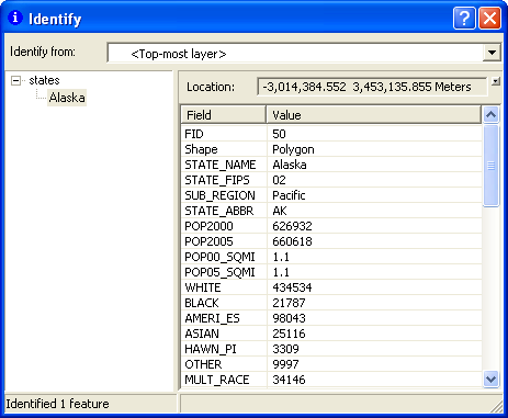
When you don’t have the attribute table open, a quick
way to get information about a particular map feature
is to use the tool Identify.
- In ArcMap,
in the toolbar Tools,
click on the tool Identify.
- The dialog Identify will
open; move it to a convenient location that doesn’t
obscure the map.
- In the menu Identify from:,
choose which layers you want to select from:
- <Top-most layer>;
- <Visible layers>;
- <All layers>;
- A particular layer.
With a single layer on the map, these
options all have the same effect; there
will be more about multiple layers later.
- Click on a feature in the map, and the data fields
in its row in the attribute table will be displayed.
More often than not you won’t recognize a feature on the
map, but you can find it without going into the attribute
table using the tool Find.
- In ArcMap,
in the toolbar Edit,
click on the tool Find.
- The dialog Find will
open; move it to a convenient location that doesn’t
obscure the map.
- Click on the tab Features if
it’s not already selected.
- In the field Find:,
type in some piece of information you know about
the feature such as its name.
- In the menu In:,
choose which layers you want to select from:
- <Top-most layer>;
- <Visible layers>;
- <All layers>;
- A particular layer.
With a single layer on the map, these options
all have the same effect; there will be more
about multiple layers later.
- In the button group Search:,
choose which attribute field you want to search
for this information:
- All
fields;
- In field:,
and then choose one of the available fields
from the menu;
- Click the button Find,
and a
list of matching features will be displayed at
the bottom of the dialog.
- Click on the feature of interest and the map
will flash its location.
- If you right-click on the feature of interest,
a contextual menu will appear, and you can choose
some other options, such as Zoom To.
There is, of course, a more general way to identify features on a map,
and that is by labeling them on the map itself.
Every map you’ve ever seen probably includes labels that give names to
the features on the map.
ArcGIS can label a layer with any of the data
in its attribute table, and it will intelligently position
them to avoid overlap with other layers’ labels.
The general properties of a layer, such as labeling and the data source,
are controlled through the dialog  Layer Properties,
which you will see a lot of from this point onward. Layer Properties,
which you will see a lot of from this point onward.
- In ArcMap, in the Table of Contents, right-click on the name of the layer, e.g. states.
- The layer’s contextual menu will now appear; it provides many actions that apply just to this layer. Select the menu item Properties....
Shortcut: you can also open a Layer Properties
dialog by double-clicking on the layer’s name
in the Table of Contents.
- In the dialog Layer Properties, click on the tab Labels, which looks like the following:
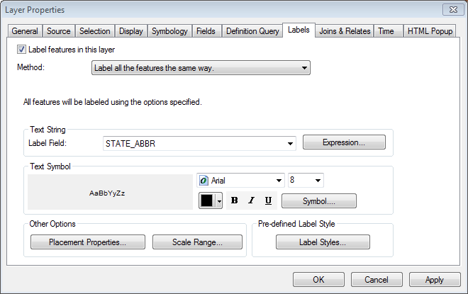
- For labels to appear on your map, you must click on the checkbox Label features in this layer.
 In the section Text String, in the menu Label Field, choose which attribute you want to use for the labels. In the section Text String, in the menu Label Field, choose which attribute you want to use for the labels.
For example, select STATE_ABBR to use state abbreviations, which are smaller than the state name and will fit the map more easily.- In the section Text Symbol, choose a font, font style, font color, and font size.
Labels appear at the chosen size relative to the computer screen and independent of the map scale, so you will probably need to adjust them when you are nearing completion of the map and know how much room you have for them.
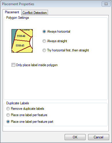
- By default labels will not overlap and will disappear when necessary. Also by default every part of a feature will be labeled (e.g. all of the Hawaiian islands). These options and more can be changed by clicking on the button Placement Properties… and making appropriate adjustments.
- Click the button OK (or Apply if you want to see the effect without closing the dialog).
- Once you have chosen the attribute that you want to use to label the layer, you can quickly turn the labels off and on in the Table of Contents, by right-clicking on the name of the layer, e.g. states, and then, in the layer’s contextual menu, selecting the menu item Label Features.
Zoom into the map to verify that the labels you’ve added appear at an appropriate scale.
Right-click on the map layer again and select Properties to bring up the Layer Properties screen. Now select the Symbology tab.
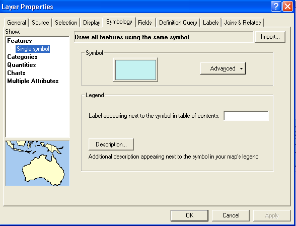
At present, the map is colored using a single color (symbol) for every feature (state polygon). If we simply wanted to change this color, we could click on the colored rectangle and select a different color. However, what we want to do is color the states different colors. To color the states different random colors, select Categories (which will bring up a new screen), set the Value Field to STATE_NAME--because we want to give different colors to states with different names. Then choose a Color Scheme on the right that consists of patches of distinct colors.
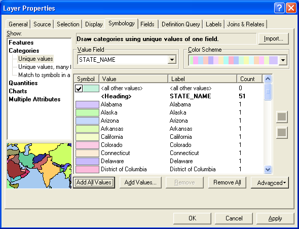
Click the Add All Values button and OK. Each state will now be colored by one of the colors from the scheme you chose. You can go back to the original single color for all states through the Symbology tab by selecting Features then Single Symbol then OK.
|
Checklist for Coloring states random colors
- Right-click the states layer and select Properties
- Click the Symbology tab
- Select Categories
- Select STATE_NAME as the Value Field
- Select a Color Scheme with patches of colors
- Click Add All Values
|
Right-click the states layer, select Properties and then the Symbology tab. Select Quantities on the left.
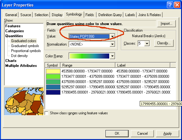
Begin by selecting the quantitative variable for coloring the map as
the Value in
the Fields section.
Coloring a map using a quantitative variable
is more complicated than coloring it using random different
colors. There are three basic choices to make:
- You need to select a color scheme from the ones
provided. Generally you will select a color ramp whose
values vary in a continuous way to indicate change
in the quantitative variable.
- You need to decide how many value classes you
want to use. This will group the values into a
discrete set of ranges.
- Finally, you need to decide what method
you will use to classify the values (choose the value
ranges). ArcMap provides several ways to do this automatically,
as well as the option of letting you set the break points
between categories manually.
Such a map is sometimes called a heat map because of its common use to describe temperature, though usually with a blue-to-red (cold to hot) color ramp.
ArcMap will by default use five categories and the natural breaks method for dividing the values into five categories. The natural breaks method tries to draw the lines between categories of values where they naturally break. If you want more categories, you can easily change the number. Usually between five and eight categories works reasonably well. If you use too many categories, the color values may be difficult to distinguish.
To use a different method of classifying values, click the Classify button over on the right side of the screen.

The quantile method creates categories with near-equal numbers of features in each. If we use it to create five categories of states and there are 51 states (50 states and the District of Columbia), we will get categories that each contain ten or eleven states. The equal-interval method divides the values into categories whose value ranges are the same. Choose one of these methods and click OK on this screen and then on the Layer Properties screen. The map will be colored--or symbolized according to the choices you made.
|
Checklist for coloring a map using a quantitative field
- Right-click the states layer and select Properties, then the Symbology tab
- Click Quantities
- Select the field you want to use in Field Value
- Select the number of Classes
- Choose a Color Ramp
- Click Classify to change the classification scheme
|
When looking at a map like the previous one, which displays population as a color spread out over the entire state, our brains automatically integrate the area, emphasizing larger states over smaller states, even if they have the same population. Compare, for example North Dakota and Alaska — which one looks like it has the larger population? They actually have the same population, with only a 2% difference.
So, instead of coloring a map with a simple numeric attribute
such as “total population ” — an extensive quantity — it’s usually better to divide it by the state’s area to map population density — an intensive quantity. It’s also reasonable to map
the ratio of any two extensive attributes where that makes sense, e.g. “people over 80” divided by “total population”, to find the relative fraction of an attribute, which is also an intensive quantity.
In either case, this is easily accomplished in ArcGIS by specifying the field in the denominator as a normalization field.
Such a representation of data is known as a choropleth map, from the Greek for khōra (region) + plēthos (multitude).
Exercise: Normalizing Data
Using data for the female population of each state, normalize it by the male population, and map with an appropriate symbolization.
Both the classification and normalization of your data can make major changes in the way your map looks and in the way it’s interpreted by someone who neglects to read the legend. It’s important to make these choices based on an understanding of the data, with an eye on establishing visual contrast between different data groups.
Once you have colored a layer in a particular way,
it’s sometimes useful to save that configuration for
future use, such as in another map. A layer document stores
a reference to a data set and how it’s currently symbolized.
It can be added to a map just like the plain data
set.
- In ArcMap,
in the Table of Contents,
right-click on the name of the layer, e.g. states.
- The layer’s contextual menu
will now appear; select the menu item Save
as Layer File....
- The dialog Save Layer will
appear. It’s advisable that you navigate
to the same folder containing the shape
file with which you’ve you’ve been working.
- Your
layer document will have
a file extension of
.lyr .
Choose a root name describing
the data and symbology
in this file, e.g. states-pop2000,
and click the button Save.
One of the most powerful features of ArcGIS is its ability to display
multiple map layers at once, much like a set of transparencies
allows different views to be displayed together in many
combinations. To see how this works, we’ll add more and
different types of data to your map, beginning with the
plain states file you loaded earlier.
Exercise: Comparing Different Symbolizations of the
Same Data File
- Change the symbology of the layer states to
be Features using
a Single Symbol with
no fill color and a thick, bright red outline
 . .
- Add in the layer file that you created in
the previous procedure,
 states-pop2000.lyr (see
the procedure Adding
Prepared Data to a Map for details on adding data).
It will be placed above the previous layer
in the Table of Contents, which means it
will appear in front of
it in the map itself. It references the same
data set, but includes the symbology you
created previously. states-pop2000.lyr (see
the procedure Adding
Prepared Data to a Map for details on adding data).
It will be placed above the previous layer
in the Table of Contents, which means it
will appear in front of
it in the map itself. It references the same
data set, but includes the symbology you
created previously.
- In the Table of Contents,
you may have noticed the checkboxes to the left
of the layers’ names; they are used to turn their
display on and
off
 .
Click off the upper layer’s checkbox to reveal the
lower layer in the map, then click it back on again. .
Click off the upper layer’s checkbox to reveal the
lower layer in the map, then click it back on again.
- You can also rearrange the layers by clicking
on one layer’s name in the Table of Contents and
dragging it above or below another layer;
this places it in
front of or behind the other layer in the map.
- Finally, remove the more symbolized layer to return to the
original single-symbol layer:
- In ArcMap,
in the Table of Contents,
right-click on the more symbolized layer states-pop2000.
- In the layer’s contextual menu,
click on the menu item
 Remove. Remove.
Next we’ll add a different type of data, a set of points:
Exercise: Adding and Symbolizing a Point Layer
- In ArcMap, in the toolbar Standard, click on the button Add Data.
- In the dialog Add Data, navigate into the folder constructingmaps.
- Note how the file icon for
 cities.shp shows
points, indicating the type of data to be displayed.
Click on cities.shp,
and click the button Add. cities.shp shows
points, indicating the type of data to be displayed.
Click on cities.shp,
and click the button Add.
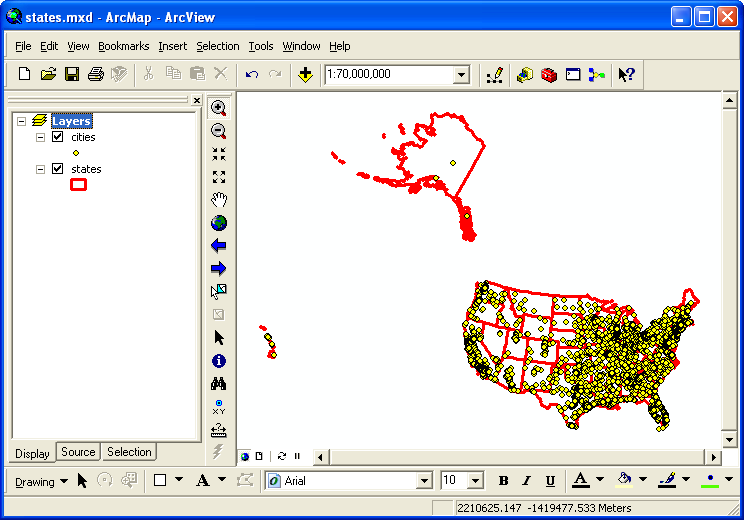
Now many points
appear on the map, indicating the different cities
in the layer. By default, a point layer will
automatically be placed in front of all polygon
layers on the map, to avoid being covered over.
- Use the tool Identify to learn more about specific cities. You may need to zoom in to spatially distinguish some cities.
- In the Table of Contents, just
below the layer cities,
you’ll see the same symbol
 being
used to represent the layer on the map. Click on the symbol to open
the dialog Symbol Selector,
and try out the available options. being
used to represent the layer on the map. Click on the symbol to open
the dialog Symbol Selector,
and try out the available options.
Exercise: Displaying a Data Subset
Can you make just the capital cities visible on the map above? (Hint: right-clicking on pretty much anything in ArcGIS will bring up a contextual menu of available options for using it.)
Save your result as a layer file so you can easily reference it later.
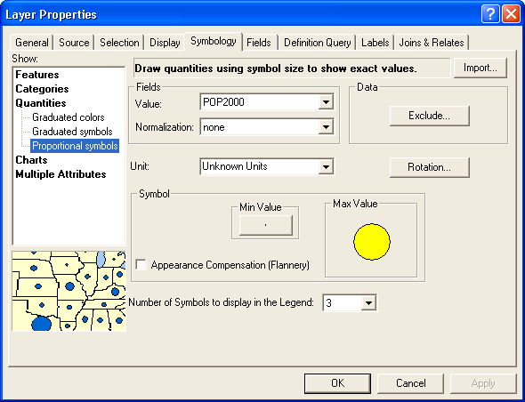
The previous step only allows you to select a uniform symbology for the points in a point layer. Like polygons, it’s also possible to vary the symbol based on values in the layer’s attribute table, but in several unique ways such as changing the symbol size.
- In ArcMap, in the Table of Contents, double-click on the layer’s name, e.g. cities.
- In the dialog Layer Properties, click the tab Symbology.
- On the left side, in the list Show:, click on the list item Quantities.
- Click on the sub-list item Proportional Symbols.
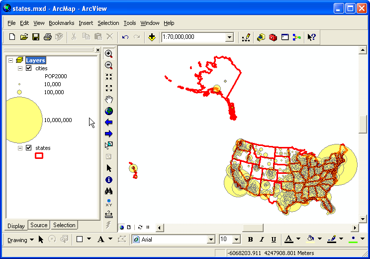
- In the section Fields, in the menu Value:, select an attribute to use, e.g. POP2000.
- In the section Symbol, click on the button Min Value,
- In the dialog Symbol Selector, choose a symbol type, a color, and a minimum size, e.g. 1.
- Click the button OK.
- Back in the dialog Layer Properties, click the button OK. The size of the cities’ symbols are now based on their populations.
- In this symbolization the smaller symbols are placed on top of the
larger ones so they are more visible, however
they may still be so thick in some areas that
you cannot distinguish the state boundaries behind
them. One way to compensate for this is to change
their transparency:
- Double-click on the layer you want to change,
e.g. cities.
- In the dialog Layer
Properties,
click the tab Display.
- In the field Transparent:
%, type a percentage value, e.g. 50.
- Click the button OK.
Procedure: Adding and Symbolizing an Image Layer
We’ll add one type of raster image, representing elevation. It will
come from a local repository of map data that we
maintain here at Amherst College.
- In ArcMap,
turn off the layer cities so that
only the
layer states is visible.
- In the toolbar Standard,
click on the button Add
Data.
- In the dialog Add Data, navigate into the folder constructingmaps, and add the file
 gtopo_1km by
clicking once on its icon and then clicking the
button OK.
(If you click twice on an image, it may “open”
like a folder and provide its three color bands
separately, depending on the type of image.) Note how its icon shows
a grid of pixels, indicating the type of
data (image). gtopo_1km by
clicking once on its icon and then clicking the
button OK.
(If you click twice on an image, it may “open”
like a folder and provide its three color bands
separately, depending on the type of image.) Note how its icon shows
a grid of pixels, indicating the type of
data (image).
- In the dialog Geographic Coordinate Sytems Warning,
ignore the information provided and click the
button Close.
We will consider the implications of
this dialog later when we discuss coordinate
systems.
A grayscale representation of elevation will
now appear. Note that, by default, an image layer
will be placed behind a polygon layer to avoid
obscuring it, so initially you may not be able
to see some of this layer because it is covered
up by the states layer.
 Raster
layers have one value for each pixel, in this
case representing elevation, and as
with vector layers that information can also be displayed: Raster
layers have one value for each pixel, in this
case representing elevation, and as
with vector layers that information can also be displayed:
- In the toolbar Tools,
click on the tool Identify.
- To avoid displaying only information about other
layers (such as states),
in the dialog Identify,
change the menu Identify
from: from the default menu item, <Top-most
layer>, to another such as <Visible
layers> or specifically
 gtopo-1km. gtopo-1km.
- Click on
different locations
to determine their elevation.
- Raster layers are displayed by assigning each
pixel a color based on its value. This can be,
for example, the red, green, and blue values
of a photograph, each in the range 0 - 255. In
the case of a single-valued quantity such as
elevation, a
grayscale ramp is used by default, where the elevation
range shown above in meters, –407 to 8752,
is mapped to the black-gray-white values 0 -
255 (the latter shows up as the stretched value in the
dialog Identify).
A number of other color
ramps are available,
e.g.
 ,
which runs from bluish green at the lowest elevations
to red and then white at the highest elevations
(suggesting “snow-capped mountains”). ,
which runs from bluish green at the lowest elevations
to red and then white at the highest elevations
(suggesting “snow-capped mountains”).
Double-click
on the layer gtopo_1km to
bring up the dialog Layer Properties,
click on the tab Symbology, and
try out a number of different color ramps.
Question:
Which two places on the surface of the Earth are pinpointed by the maximum and minimum elevations, 8752 and –407? What is the linear unit here?
The colors in the color ramp are associatd with stretch
Exercise: Setting Elevation Limits
Zoom in on New England. We know it’s mountainous here, but you won’t see much contrast because the color ramp is set to the work with all of the mountains in the world. Set a more reasonable range of elevations by finding an appropriate type of stretch for the color ramp.
A lot of geographic data is available from government, commercial, and other sources, often in a ready-to-use format.
Often you’ll want to provide background for your data, such as streets or terrain, and not have to worry about constructing it yourself.
The company that makes ArcGIS, ESRI, provides a large number of basemaps through Internet servers, which you can easily add to your ArcGIS map.
ArcGiS Online (www.arcgis.com) is a source of geographic data in formats that are ready-to-use
with ArcGIS “Desktop”.
It has datasets provided by ESRI (in particular the same basemaps as above, and others that sometimes duplicate
what’s in G:\Maps),
as well as many that are contributed by others.
ArcGIS Online (www.arcgis.com) can be accessed both from within ArcGIS Desktop and, more conveniently, from any web browser.
- If necessary, start up a web browser:
- Click on
the menu Start.
- Point at the menu item All Programs.
- Locate your
preferred web browser,
 Chrome or Chrome or  Firefox or Firefox or  Internet Explorer
(perhaps in the folder Networking and Communications),
and click on it. Internet Explorer
(perhaps in the folder Networking and Communications),
and click on it.
- In your web browser, visit the web address www.arcgis.com.
- At the top of the page, click on the link Gallery.
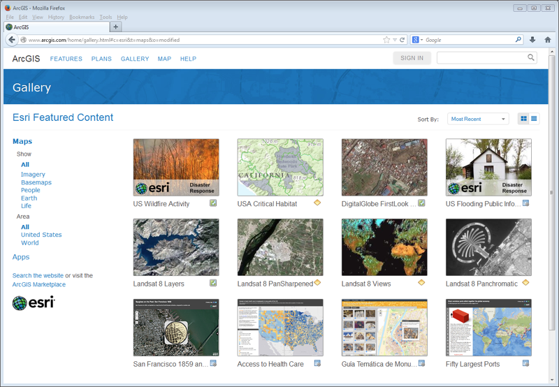
- On the page Gallery you can browse for different types of data amongst the “featured content”, but it’s generally better to search for keywords. In the upper-right corner of the page, click in the text field
 Search for,
type one or more keywords, e.g. usa major rivers, and in the menu that pops up, click on the
menu item Search All Content. Search for,
type one or more keywords, e.g. usa major rivers, and in the menu that pops up, click on the
menu item Search All Content.
- On the left side of the window, check on the box Show ArcGIS Desktop Content; otherwise everything displayed will only work within ArcGIS.com.
- Scroll down to review the found items; you’ll
see a number of data types:
- ArcGIS Desktop 10-usable, which may be downloadable or referencible internet services:
 Shapefiles and CSV tables; Shapefiles and CSV tables;
 Layer
Packages; Layer
Packages; Features, Tiles, WMS, KML, and Map Images, which are internet data services; Features, Tiles, WMS, KML, and Map Images, which are internet data services; Map Documents, which are .mxd files. Map Documents, which are .mxd files.
These
documents seem to generally include
references to data inaccessible
to anyone outside of the author
(or a small circle), so unless
you can locate all of the data
within ArcGIS.com, they probably
won’t be useful to you.
- Web browser-viewable
 Web
Maps.
These can be fun to study and play around
with, but aren’t usable with ArcGIS Desktop
10. Web
Maps.
These can be fun to study and play around
with, but aren’t usable with ArcGIS Desktop
10.
You can click on the titles of these data sets to get more
information about them, e.g. their size,
author, and any restrictions on their
use.
- Choose a data set
from one of the first two data types, e.g. the
layer package USA Major Rivers,
click on menu
 More options and select the menu item Open in ArcGIS for Desktop. More options and select the menu item Open in ArcGIS for Desktop.
- In the subsequent file download dialog, you can open the file
directly (but it will be saved in a temporary
location), or you can save it first in a convenient
location (e.g. the folder constructingmaps),
and then add
it to your map.
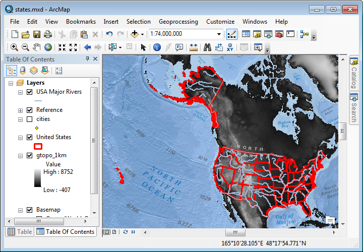
- The downloaded file will have the name item.pkinfo, which is a reference to the layer on arcgis.com.
As with basemaps,
the drawback to using an Internet server as a data source is that they can sometimes be unavailable
or slow to load; you may wish to turn them off until you are ready to publish your map.
- You can create a free account with ArcGIS Online and create your own publically accessible web maps by uploading materials you create with ArcGIS (beyond the scope of this course). If you are a student, faculty, or staff member of Amherst College or one of the Five Colleges, you can Sign in with your enterprise login.
It’s always worth searching the Internet for geographic data.
Much of this data must be converted into a format that ArcGIS can properly
display, and working with such data will be the topic
of the next few sections.
However, many sets of data are “prepared”
data, i.e. they are ready to be loaded into ArcGIS and
immediately displayed.
Commonly such data would be labeled as shapefiles, though
they are likely to be packaged as a .zip archive that
Windows will automatically open.
Another relatively new format is the geoTIFF, a standard TIFF image that’s been enhanced with geographic information.
Exercise: Mapping Interesting Data
Look around on ArcGIS Online, or on the Internet using a keyword such as shapefile or geoTIFF, to find another dataset related to your interests and map it. Would it be relevant to add other related datasets? If so, see if you can find and add them to your map. Symbolize them so that they’ll stand out relative to the other datasets on your map.
The ArcGIS software is not available to most people, so its documents
are not easily sharable. However, there are a number
of different ways to save sharable maps depending on the
purpose you have in mind. You can print on paper, create
an image, create a PDF, or export it to the free applications
Google Earth or ArcReader.
Cartography describes the clear, elegant,
and even artful design of a map.
With an appropriate choice of
content, structure, symbology, and labels, a map can
speak volumes while still being easy to read and understand.
A map that is just thrown together may be helpful to
the author, who knows what to look for, but could be
confusing and quickly ignored by an intended audience.
Entire books have been written on designing good maps.
In lieu of reading one of them, here are some
important considerations to keep in mind when preparing
your maps for sharing:
- Color: Choose an appropriate
symbology for your data and background for your
maps that will enhance rather than detract from the
visibility of your data.
There are a number of color standards that people respond to perceptually, e.g. darker colors for larger numbers, and others that they expect, e.g. green for forest areas, etc.
Colorblindness also prevents some people from distinguishing certain colors. So it’s a good idea to pick your color combinations carefully. Visit http://colorbrewer2.org/ for some ideas.
Also note that many journals still only publish black-and-white maps, which may require simplification.
- Contrast: More generally, the different elements of your map need to be distinguishable from each other. Pick symbols, labels, and graphic element backgrounds so that they are visible when they overlap.
- Scale: Usually you will want to
use a scale such that your data or important
background elements have maximal magnification and
are centered. If printing on paper, use the dialog Page
and Print Setup… to orient the paper
as portrait or landscape to match the data.
- Projection: This is a topic that
will be discussed later,
but in most cases it’s important to use an appropriate
projection that reduces distortion over the area
of interest.
- Standard Map Elements: A number
of additional elements that help explain the map,
such as a legend, north arrow,
and scale bar, should
always be included, and these will be described next.
- Titles and Captions: The names of data layers
will be visible in the legend, so make sure they
are not the default abbreviated names. In most cases
the map itself should also have a descriptive title.
- Graphics: Other graphic elements are often useful, such as arrows to point out particular features, and can be added using the Draw toolbar.
- Inset Map: For larger-scale maps, it can be helpful to include a small-scale map as an inset to provide a locational context within a more well-know geography, e.g. a particular region within New England. Thes
When you publish your map to static formats such as paper, digital images,
or PDF, you’ll need to define a size for the output,
which you can think of simply as the paper size. Menu File > Page
and Print Setup..., and proceed in the usual way to choose Printer, Paper
Size, Paper Orientation, etc. In addition,
you’ll probably want to check the box Use Printer Paper Settings,
since that is usually a good size for sharing.
To see how your map will look on the printed page, go to the View menu and select Layout View.
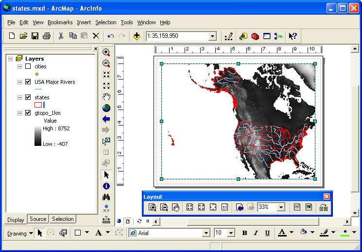 This displays the map to fit inside the margins of the paper type chosen. You can change the margins by clicking on them and dragging one of the blue boxes to a new position. Note the thin gray dotted line; it shows the actual limits to printing on the paper size for the printer you’ve chosen. This displays the map to fit inside the margins of the paper type chosen. You can change the margins by clicking on them and dragging one of the blue boxes to a new position. Note the thin gray dotted line; it shows the actual limits to printing on the paper size for the printer you’ve chosen.
The map as displayed in the margins is the same one you’ve chosen in the data view, no matter how big or small the margins are. You can use the same tools in the toolbar Tools to change the relative size and position of the map within those margins. Important: in the Layout View, you should have access to the toolbar Layout, which provides similar tools that reference the paper rather than the map — with them you can zoom into the paper without changing the size of the map relative to the paper.
Before sharing your map, it’s a good cartographic practice to add a title, a legend to describe the different layers, a north arrow to show directions, and a scale bar to show the map scale:
- Go to the menu Insert and select the menu item Title, and a text box will appear near the top center of the screen. Enter a title and drag the box to an appropriate position.
- Next go again to the menu Insert and this time select the menu item Legend. Take all the defaults by clicking the button Next on each of the series of screens. Drag the legend to an appropriate place and resize it if necessary.
- Now menu Insert and select the menu item North Arrow...; choose your preferred style, click the button OK, and then move the arrow where you would like it.
- Finally menu Insert and then select the menu item Scale Bar...; choose your preferred style, click the button OK, and then move the scale bar where you would like it. Note that by default the scale uses whatever the map units are; you can change that by double-clicking on the bar and choosing a different one.
If necessary, resize the margins around the map to fit these new additions.
ArcMap can have multiple data frames defined in its Table of Contents,
but only one of them can be displayed at a time in the Data
View.
However, layouts can
display the maps from all frames at once,
for example to show an overview map in an inset box.
The most basic way to share maps is to save them in one of the file formats commonly found on the Internet.
Go to the menu File and choose the menu item Export Map.... Then navigate to the folder in which you want to save the map.
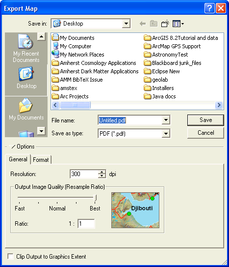
If your intent is to use the map on a computer, such as in a web page or a PowerPoint presentation, where printing is a secondary consideration:
- If you have raster images in your map, select
JPEG as the format; it will provide lossy but excellent compression.
- Otherwise choose
PNG, which produces good compressed files from vector graphics (it also does a reasonable job on raster graphics).
Choose an image resolution of about 100 dots per inch (dpi), good for display on most computers.
If your intent is to use the map in a paper or a poster that will be printed, for example with Microsoft Word or Adobe InDesign, you will want to save it in an image format that preserves lots of detail; TIFF works well. Choose a resolution of at least 300 dpi.
If you would like the map to be a stand-alone document, then the Acrobat format PDF is a good choice. These files can be easily displayed by most people with the Adobe Reader software, and it’s readily downloaded by web browsers. PDF will preserve more of the details of the map, and so it’s a good way to distribute it if it will later be printed. A PDF map even provides some degree of interactivity, e.g. turning layers on and off. Important: make sure you click on the tab Format and then choose the checkbox Embed All Document Fonts; this will help keep the document readable by everyone.
Experiment: Try producing all three of these file formats, and compare them. In the PDF document, note the tab on the left called Layers; click on it and then click on the “eye” icon next to one of your layers, and observe what happens.
The free application Google Earth has become very popular, as it provides
imagery of the Earth’s surface
(taken from airplanes or satellites) in an easy-to-access format — if you
have an internet connection.
It’s also a lot of fun to use, as you can zoom around the Earth and view it from different perspectives, including terrain and buildings in 3D!
ArcGIS is a useful program to create additional layers that can be viewed in Google Earth.
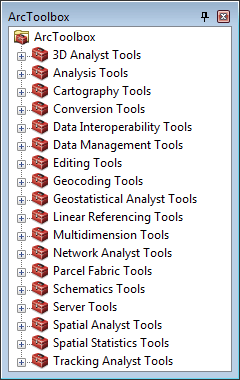
Exporting to Google Earth makes use of a special geoprocessing tool, an extra program that transforms geographic data into new formats from which additional information can be extracted.
Geoprocessing tools are stored in a collection called ArcToolbox.
The next two procedures are preliminary steps useful for most geoprocessing activities.
By default geoprocessing tools run in the background so that you can continue using ArcMap for other things, but it’s harder to monitor and there can be occasional failures that don’t otherwise occur. So until you’re used to these tools, it’s better to run them in the foreground, even though it will then be the only thing that ArcGIS is doing.
- Menu Geoprocessing, then select the menu item Geoprocessing Options….
- In the dialog Geoprocessing Options, in the area Background Processing, click off the checkbox Enable.
- Click on the button OK.
Google Earth uses a geographic format known as Keyhole Markup Language, KML for short, which is sometimes compressed to a smaller size using ZIP compression to produce a KMZ file. ArcToolbox provides tools to export both individual layers as well as entire maps.
- In ArcMap, open
 ArcToolbox
as described in the previous procedure. ArcToolbox
as described in the previous procedure.
- Click on
 Conversion Tools, then on To KML, and finally on Conversion Tools, then on To KML, and finally on Layer to KML. Layer to KML.
- In the dialog Layer to KML, there are a number of fields that let you specify the items you want to process and any information that may be required.
Note the button Show Help >>, which opens the right-hand panel to provide an explanation of the purpose of the tool and, when you click on each item, what it is expected:
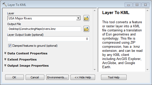
In the field/menu Layer,
select a layer or map to export, e.g. USA
Major Rivers.
- In the menu Output File,
choose the output path of the file you want to create, e.g. rivers.kmz; it’s usually easiest to click on the button Browse to choose a folder and the name and type of the file.
- Click the button OK; when geoprocessing is run in the foreground, a dialog will appear describing the process and listing any errors that occur:
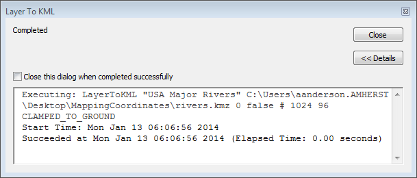
When geoprocessing is run in the background, to see the results or any errors you must menu Geoprocessing, then select the menu item Results.
 Click the button Close to dismiss the dialog. Click the button Close to dismiss the dialog.
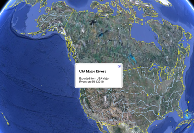
- Navigate to the folder where you stored the KMZ file, and double-click on it to open it in Google Earth.
When the layer appears in Google Earth, you should be to see the
labels when you zoom in far enough, and an information
balloon should appear when you click on any
feature. Note that the labels are stored as a
separate layer from the features, so you can
click them off if
you want to.
- The KMZ file can also be displayed in the World-Wide Web site Google
Maps by first putting it in own your web
site, copying its web address (URL), and then visiting http://maps.google.com/ and
pasting the URL in the field Search.
The button  Link will provide a URL for the Google map with your layer added, allowing you to share it. Link will provide a URL for the Google map with your layer added, allowing you to share it.
It is also possible to create an interactive map that allows the viewer
of the map to explore it by zooming and viewing attributes, very similar
to what you have been doing already with ArcMap.
Such interactive maps use the free program ArcReader, though it’s only
available for Windows.
Creating an ArcReader map involves using the extension ArcPublisher.
Exercises
If you are interested in applying what you’ve learned to some slightly
different kinds of maps, here are some additional exercises.
They use map files in the exercises folder
in the Introduction to GIS folder.
|

 Procedure
13: Symbolizing a Point Layer Using Proportional Symbols
Procedure
13: Symbolizing a Point Layer Using Proportional Symbols
 Procedure 17: Opening ArcToolbox
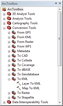 Procedure 18:
Exporting a Layer to Google Earth
Procedure 18:
Exporting a Layer to Google Earth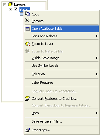 Procedure 5: Viewing a Map Layer’s Attribute Table
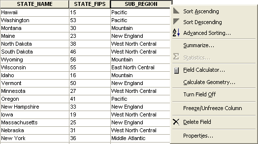 Procedure 6: Sorting Attribute Table Records
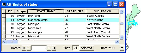 Procedure 7: Locating Attribute Table Records on the Map
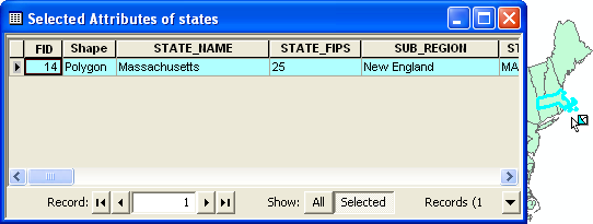
 Procedure
9: Identifying Features
Procedure
9: Identifying Features Procedure
10: Finding Features
Procedure
10: Finding Features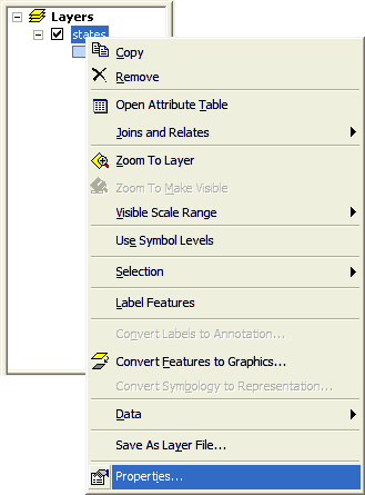 Procedure
11: Labeling a Map Layer
Procedure
11: Labeling a Map Layer