Collecting Data with Excel
|
|
This tutorial provides examples of how Excel can be
used to create data collection templates that might be used in a classroom
laboratory.
Those who are unfamiliar with Excel may wish to first read The
Basics of Using Excel.
The fundamentals of graphing data with Excel are described
in Graphing with
Excel.
Those interested in another application of Excel in the curriculum should
read Grading with Blackboard
and Excel.
Preformatted templates can be useful in lower-level
lab courses to hide the complexities of Excel.
A Data Collection
Template
Excel has a number of features that make it useful
for designing data collection templates.
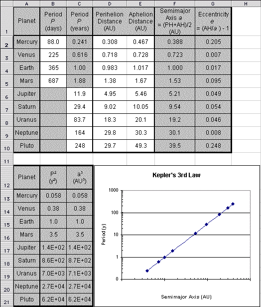
- An introductory astronomy lab uses a planetarium program to calculate
positions of planets and compare them with some famous predictions by
Kepler:
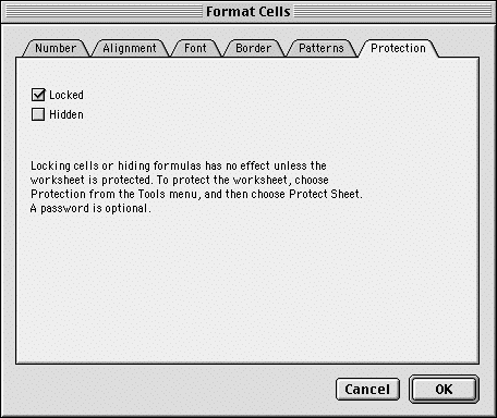
- The data that the students collect are to be entered into the white
cells; the others contain formulae that automatically calculate the
desired results.
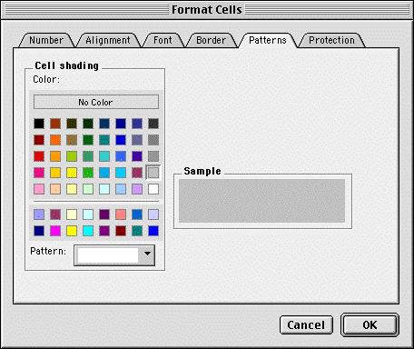
To indicate their special status, they are selected and then changed
to a different background using the Format Cells dialog:
| |
Menu: |
Format  Cells...
 |
| |
Click: |
Format Cells  Patterns
 |
| |
Click: |
Format Cells
Patterns
Cell shading
Color:
[gray] |
Template Formatting Options
Excel provides a lot of flexibility for setting up
templates.
- The planetarium program provides the data in days for the first
four planets (because they are relatively short), and in years for
the last five planets:
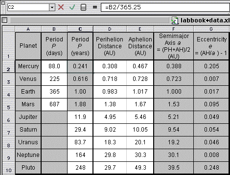
However, for our calculations we need the period to be consistently
expressed in years.
So, the template can be organized to convert days to years for just
these four planets but not the others (note the formula for cell C2).
- One thing that students always want to do is write down too many
digits of information.
The cells can therefore be formatted
to display only the appropriate number of digits for the quantity
in question (see the picture above)
Any extra digits "disappear" in the display, reinenforcing
the notion that they are meaningless.
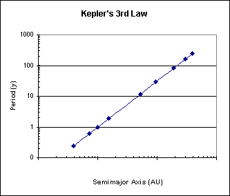
- Kepler's Third Law equates the square of a planet's orbital period
P to the cube of its semimajor axis a (its average distance
from the Sun).
It is therefore useful to graph P and a on a log-log
plot, as they should then fall along a straight line with a 2/3 slope:
Excel allows you to easily set a logarithmic scale:
| |
Double-click: |
[chart]
[axis] |
| |
Click: |
Format Axis
Scale |
| |
Click: |
Format Axis
Scale
Logarithmic Scale |
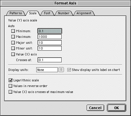
Note that the minimum and maximum values must be positive for this
type of scale.
- This brings up an interesting dilemma when data hasn't been entered
yet.
The input to the graph will be zero, and Excel complains vociferously.
To get around this, the calculation of the semimajor axis a
can have a small number added to it, as in cell F2 below:
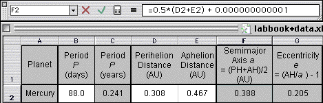
Because the representation of the number has been limited to a few
digits, the calculation shows up as 0.000 when there is no input data.
- This approach doesn't work for the period P because its data
is partially entered directly, which would be deleted when saving
it without input data.
As an alternative, you may set up a masked calculation field, used
only by the graph, by setting its font to white on a white background,
as in cell H2 below:
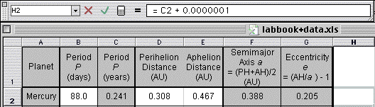
If the cell is hidden as well as locked, then
its formula also won't show up when the template is protected.
- You can download this template by clicking here.
|